|
|
|
texas websites
lone reeds on the internet
By: Thomas M. Ciesla
|
Examining The Websites:
The Good, The Bad and the Ugly
Part II: The Good
|
|
The consultants had praises for a number of the brochure-style websites. Here are their top five picks.
Spicewood Vineyards
At the top of the list was the Spicewood Vineyards website, considered the best designed, most sophisticated site. The developers made an excellent selection in colors, backgrounds, photos and attractive graphics. The visitor is greeted by an opening splash page, then moved into the main pages which leverage the use of 'frames' to organize the content -- something few Texas winery websites utilize. An easy to read navigation menu is consistently placed in the left side frame, with content directed the right side of the screen. The consultants found little to improve on this site, except to perhaps use internet 'cookies' to skip the splash page for return visitors.
|
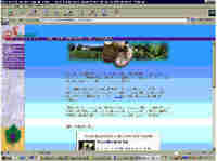
Figure 10:
Spicewood Vineyards
|
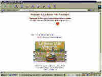
Figure 11:
La Buena Vida Vineyards
|
La Buena Vida Vineyards
Located in Grapevine, this winery captures the second website award. The well organized opening page uses a clever and attractive image map as a navigation tool. It is easy to use and a pleasure to see. The website is well organized, offers plentiful information on their wines, events and even educational classes.
One thing the consultants might change is to remove the animated graphic near the top of the opening page, thereby allowing the navigation graphic to be centered on the screen.
|
Llano Estacado Winery
Llano Estacado Winery fills the third top spot. Using a minimalist graphics style, the opening page (one screen), provides everything the visitor needs to enjoy the site. Like LaBuena Vida's navigation tool, Llano's clickable image map incorporates changing images to provide attractive, easy to follow visual cues to help the visitor.
These graphics are then carried through to the secondary pages for good visual consistency. Information is bountiful and organized in a logical manner that prevents the screen from becoming cluttered. Of course, the opening page should be centered on the screen.
|
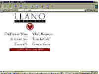
Figure 12:
Llano Estacado Winery
|
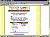
Figure 13:
Fall Creek Vineyards
|
Fall Creek Vineyards
As one of the early pioneers in the 1970's, Fall Creek Vineyards took to the Internet fairly early; they're website setting a standard for sophistication, graphics and organization. The opening page uses a clickable image map, composed of some of the nicest graphics in the Texas websites. A subtle touch -- the background of the navigation bar matches the background on the screen -- very pleasing to the eye. With a wealth of information and good organization this site is just about perfect. If anything could change, the consultants would remove the 'Coming Soon' and 'Links' box on the opening page, replace them with a simple graphic or text link to open a second small window. This would allow the navigation bar to move closer to the top of the page creating a nice single screen page. It would also look better if the opening screen was centered.
|
Pheasant Ridge Winery
Another of the early pioneers, Pheasant Ridge Winery offers visitors a unique Web-experience. Using well designed graphics and the color blue to bracket the top and bottom of the page, this website is a great example of a user-friendly, single screen opening page. The inclusion of a small map of Texas adds to the visual appeal without overpowering the page.
One change our consultants suggested was to center the page on the screen.
|
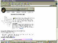
Figure 14:
Pheasant Ridge Winery
|
|
WEBSTORES
With Webstores you enter the world of E-commerce -- the buying and selling of goods on the Internet -- almost always with a credit card, though some higher-end sites may offer the ability to set up accounts in advance. As mentioned earlier, only one Texas winery currently offers this feature, Red River Winery in Old Town Spring. Look for this ability at other websites in the near future.
|
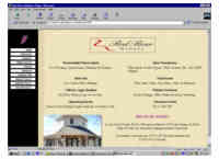
Figure 15:
Red River Winery
|
Red River Winery
Red River Winery's presence on the Web started out with a simple brochure-style wesbite created by the winery owners. Within a short time, the site was moved to safeshopper.com -- an e-commerce provider -- that supplies clients with the sophisticated programming and security requirements necessary for safe transactions over the Internet.
With the move came a new look and expanded functionality. A navigation menu was added on the left hand of the screen, the file size of photos and graphics were reduced for quick loading, and ordering on-line became the driving theme for the site.
|
|
Unlike the typical winery websites we have examined so far, at this webstore you find little information on the winery in terms of background and winemaking philosophy. Nor will you find the typical scanned wine label or a picture of one of the wine bottles. The focus here is on the products; you don't come here to get 'warm fuzzies' about Texas wine, you come here to shop! As a webstore, Red River Winery's website accomplishes exactly what it has set out to do. The text driven design approach was incorporated during the infancy of this site, and while somewhat utilitarian in presentation it is functional.
|
Intro Page 2 Page 3 Page4 Page5
|