|
|
|
texas websites
lone reeds on the internet
By: Thomas M. Ciesla
|
Examining The Websites:
The Good, The Bad and the Ugly
Part I: The Bad & The Ugly
|
Appearance, Navigation & Information
Each category of website was reviewed in terms of appearance, ease of use and information. As is typical, the least attractive, and in one case least informative were the business-card sites. As late as early Deember two Texas wineries use this method of presentation: Fredericksburg Winery and Sister Creek Vineyards. Fredericksburg Winery produces an impressive selection of wines in an attractive facility located in the historic downtown district of Fredericksburg. Unfortunately, their website offers no hint to any of this. There is no mention of the wine variety, nor could our consultants find a phone number, address or hours of operation on the site.
|
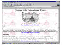
Figure 4:
Fredericksburg Winery
|
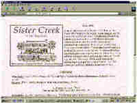
Figure 5a:
Old Sister Creek
|
Sister Creek Vineyards located in Sisterdale has been making fabulous wines for over a decade now. As recent as early December 2001, their website s - l - o - w - l - y materailzed on your screen as the whopping 355K image downoaded When we checked the website on December 29th however, a remarkable transformation had occured, rendering a once rudimentary website into an enjoyable brochure-style. Well done!
|
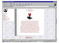
Figure 5b:
New Sister Creek |
Appearance Mis-Match
In the brochure-site category, websites run the gamut from mediocre to magnificent, and also includes a good example of a mismatch between a company's established image and it's image on the Internet. Becker Vineyards, located in Stonewall has been consistently making fabulous wines in a warm, welcoming winery. Attending events here with the Becker's is like visiting with family; the gracious couple and their staff make everyone feel welcome.
The winery's website however conveys just the opposite. A poor selection of colors, a rudimentary structure, poor use of graphics/pictures and navigation presents the visitor with a cold, austere face for this winery. Our consultants tell us that this is a frequent problem for an established company that has worked hard at developing a consistent image in traditional promotional vehicles. Too often, those responsible for creating the virtual image are not the same as those who have created the traditional image -- resulting in a lack of synergy between the two worlds.
|
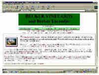
Figure 6:
Becker Vineyards
|
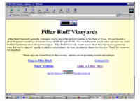
Figure 7:
Pillar Bluff Vineyards
|
Opening Pages
In addition to the tricky issue of real world/virtual world imagery, winery websites face the challenge of designing a concise yet useful opening page. There is a tendency with brochure-stye websites to overload the opening page, requiring visitors to scroll around. Our consultants prefer websites with opening pages no larger than one screen -- no scrolling required! Secondary pages can then be scrollable. This creates a simple, attractive, informative page that offers everything to the visitor in one concise package. Pillar Bluff Vineyards website is good example of this 'single screen' opening page, though the text-only approach does not produce an especially attractive Web-presence.
|
Two wineries that could benefit from this 'single-screen' rule are Hidden Springs Winery and Grape Creek Vineyards. The Hidden Springs site is trying to pack a lot of information onto this opening page: a logo, seasonal photo, wine list, text about the winery and navigation. By restricting the number of graphics/images and text, and developing an attractive navigation system, this page could convey a less cluttered image of the winery while still inviting the visitor in to 'look around' the place for more information.
|
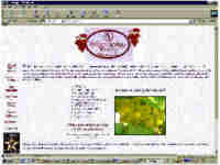
Figure 8:
Hidden Springs Winery
|
Grape Creek Vineyards is in a similar predicament, trying to do too much on a page that is dominated by their logo and navigation. This site has an additional problem: confusion and clutter created by the presence of THREE navigation systems. There is an image-based system at the top of the page, a text system at the side, and another text system on the bottom. While many sites on the Net offer Image-maps and traditional text links as backup, this redundancy has become out-dated with the predominance of the newer browsers. A better approach for Grape Creek's site would be to incorporate frame technology to keep the navigation graphics on display at all times, modify the logo to reduce the amount of screen space it consumes,(or make it a light baclground graphic) and offer an inviting yet concise welcoming message.
|
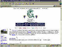
Figure 9:
Grape Creek Vineyards
|
Intro Page 2 Page 3 Page4 Page5
|